
– The users experience before point A to B –
A project as a part of a UX-course
A 7-month practical and theoretical course based on real-world cases. Completed with a focus on user research, information architecture, and visual problem-solving.
13
A / 94%
Grade
Real-world projects


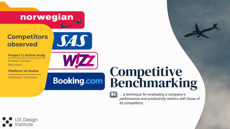
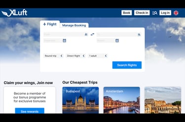
The goal of the project was to design a streamlined and user-friendly booking experience for the fictional airline Fly UX.
The concept gets proven through the prototype: thorough user-research...


Goal
Fly UX is a conceptual project grounded in one central observation: flight booking is often experienced as unnecessarily complex, stressful, and burdened by information overload — especially when users are required to make many decisions in a short amount of time.
Reduce friction in flight booking
Simplify complex decisions
Create a feeling of safety through clear progression pointers
Provide the user with a clearer overview from the initial search to completed booking.
Focus
Overview

...leads to better design desicions
Key findings
Information creates stress when presented all at once
Especially during choices related to ticket type, baggage, and add-on services.
Small textual adjustments make a big difference
A human, reassuring tone, such as the one used by SAS, lowers the threshold and builds trust.Unclear progression leads to drop-off
Missing progress indicators, hidden options, and unclear “Continue” buttons create critical breaks in the flow; users abandon the process at key moments.Expectation management is crucial
Users need continuous confirmation of what is included in the price and where they are in the process.
Solution
From insight to informed design decisions
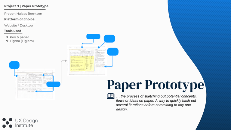
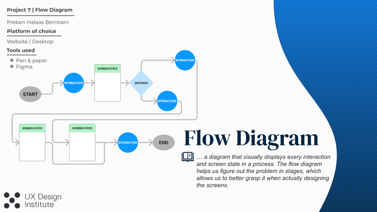
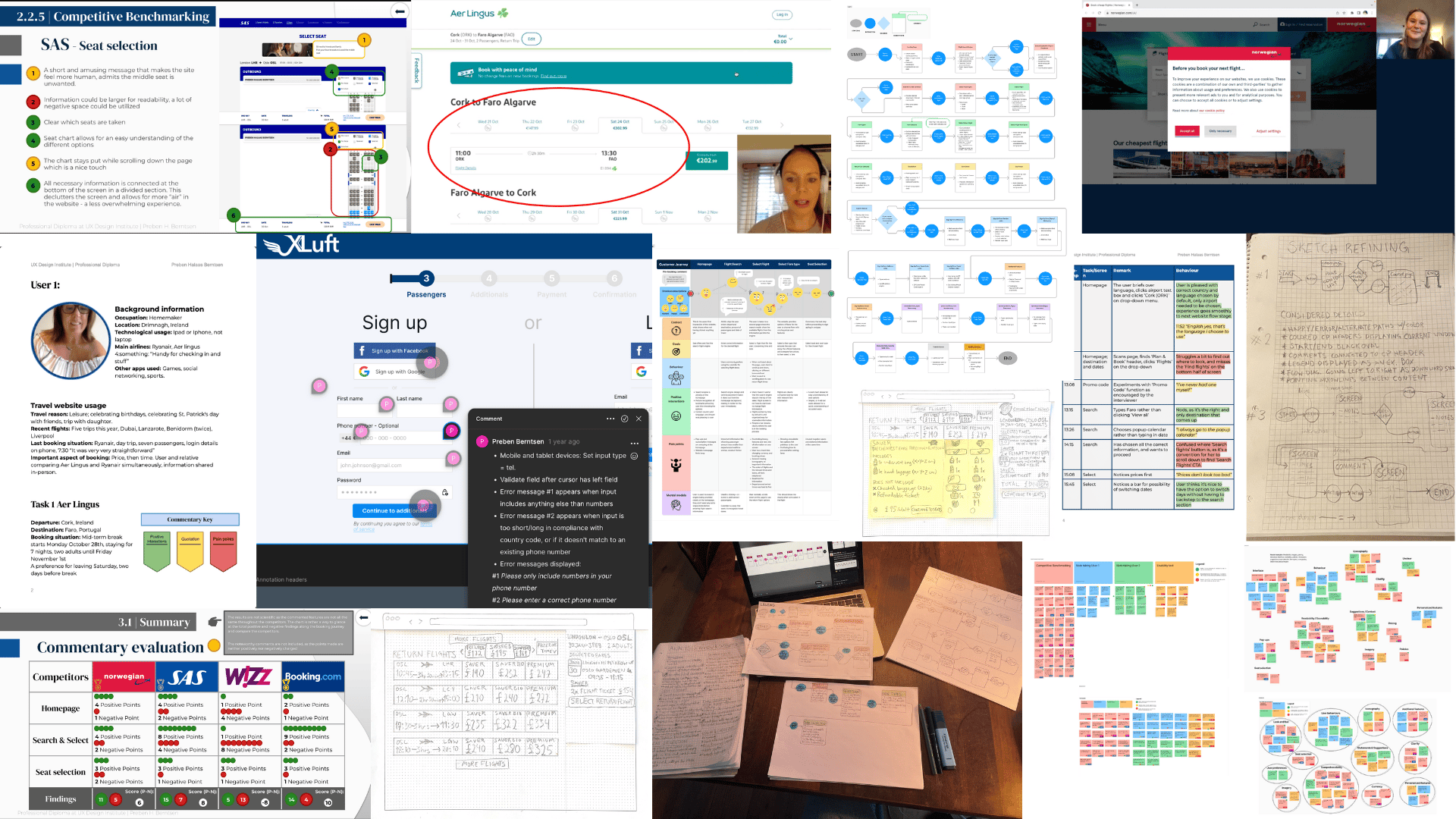
I broke down the complex booking process into logical, sequential steps – based on my research and analysis of competitors’ weaknesses in this area. By developing a detailed flow diagram, I ensured that the user is presented with only one task at a time, preventing issues from accumulating and creating friction.
I chose to prioritize visual clarity and reduce information density by removing noise and clutter, a key pain point I identified across several competitors and later confirmed through user testing. By giving critical choices, such as ticket type and add-on services, sufficient space and focus, the cognitive load is significantly reduced.
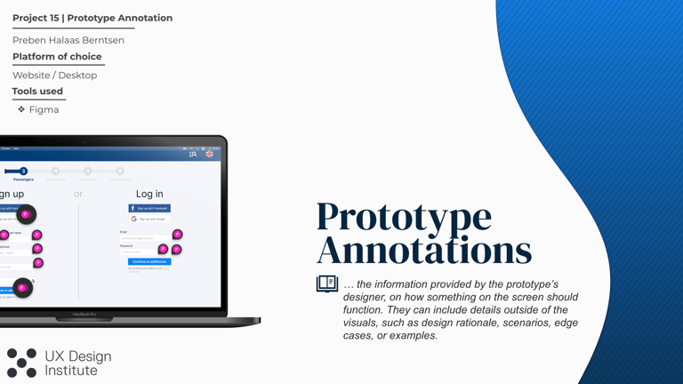
I implemented clear progress indicators and confirmation messages to give the user a feeling of complete control throughout the entire journey. Including everything from visible system status along the way to a detailed booking summary before payment. The solution transforms a potentially stressful process into a calm and predictable experience, where users always understand their progress and feel confident in their choices.
Simplification
Clarity
Confidence
The Core Milestones of the Project
Gain full insight into the research, process, and design decisions behind each project.